
One floor sample looked warm in the store, neutral at home, and suddenly pink next to your cabinets. That is exactly why homeowners keep searching for how to match flooring undertones before they commit. The surface color gets all the attention, but the undertone is what decides whether a room feels clean and cohesive or just slightly off.
If you get undertones right, even a value-driven remodel can look custom. If you get them wrong, premium flooring can still fight the rest of the room. The good news is you do not need a designer showroom budget to figure it out. You need a sharper way to read color.
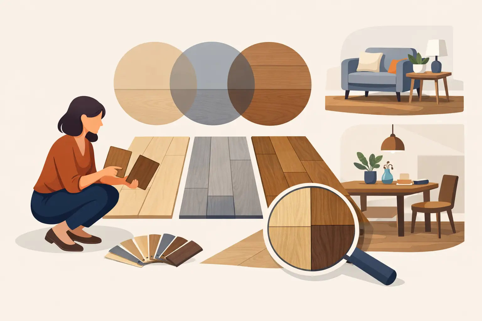
What flooring undertones actually are
Undertones are the subtle background hues sitting underneath the main color of the floor. A floor may look gray, beige, brown, or blond at first glance, but underneath that surface read, it can lean warm, cool, or neutral.
Warm undertones usually show hints of yellow, red, orange, or golden brown. Cool undertones often pull gray, taupe, ash, or even a faint blue cast. Neutral undertones sit closer to the middle, which makes them easier to work with across changing paint colors and furniture styles.
This matters because flooring covers so much visual space. Once it is installed, its undertone affects how cabinets look, how wall paint reads, and whether your room feels balanced or mismatched.
How to match flooring undertones without guessing
The fastest mistake is matching by the top color only. A medium brown floor and medium brown cabinets can still clash if one leans golden and the other leans red. The same goes for gray floors. Two grays can be completely different once one turns blue and the other turns greige.
Start by comparing samples side by side in natural daylight. Hold the flooring next to your cabinets, trim, countertop, or the largest fixed item in the room. Then step back. When undertones clash, you will notice tension right away. One surface may suddenly look pinker, yellower, or muddier than it did on its own.
If you are unsure what undertone you are seeing, place the sample next to something clearly warm and then something clearly cool. Relative comparison makes undertones easier to spot. This is especially useful with luxury vinyl plank, laminate, and hardwood, where printed grain, stain variation, or finish sheen can disguise the true color story at first glance.
Match to the fixed elements first
Furniture can move. Paint can change. Flooring is a bigger commitment, so it should usually coordinate with the elements that are expensive or inconvenient to replace.
In most homes, that means cabinets, countertops, brick, fireplaces, or permanent tile. If your kitchen cabinets are a warm medium oak, a cool ash-gray floor may feel disconnected. A floor with warm beige, honey, or natural oak undertones will usually make more sense. If your countertops are cool white with gray veining, a strongly orange floor may compete harder than you want.
That does not mean everything needs to match perfectly. In fact, exact color matching can make a room look flat. The goal is coordination, not duplication. Similar undertone families with enough contrast usually create the cleanest result.
Warm with warm, cool with cool, neutral with almost anything
This is the basic rule, and it works more often than not. Warm floors pair best with warm cabinetry, creamy walls, and earthy finishes. Cool floors work best with crisp whites, cooler grays, charcoal accents, and contemporary finishes.
Neutral floors offer the most flexibility, which is one reason they are such a smart buy for flips, rentals, and broad resale appeal. They leave more room for changing wall colors and furniture later without forcing another major update.
Lighting changes everything
A flooring sample under bright store lighting is not the same thing as a full room at home. Sun exposure, bulb temperature, shadows, and surrounding colors all influence how undertones show up.
North-facing rooms tend to pull cooler. South-facing rooms often amplify warmth. Warm bulbs can make beige and brown floors look more golden. Cool LEDs can make some floors feel flatter or grayer than expected.
That is why samples matter. Look at them in the morning, afternoon, and evening. If possible, place them in multiple spots across the room. A floor that feels balanced by the window might turn noticeably yellow in the darker corner.
For buyers who want fewer surprises, using a room visualizer can help narrow down options before ordering. It is not a replacement for real samples, but it does make it easier to eliminate undertones that clearly do not belong in your space.
Hardwood, vinyl, and laminate can read differently
The product category affects how undertones appear. Solid and engineered hardwood often show more natural variation, which can soften the undertone and make it feel richer. Vinyl plank and laminate can offer excellent value and durability, but some visuals lean more printed or stylized, so undertones may read more consistently across planks.
That consistency can be a plus if you want a clean, controlled look. It can also make undertone clashes more obvious if the color is off. A cool gray vinyl floor next to warm maple cabinets will not have the natural randomness of wood to blur the contrast.
This is where product quality matters. First-quality hard surface flooring tends to present color more cleanly and realistically, which gives you a better shot at getting the final look right. When you are shopping liquidation pricing, that is the sweet spot - premium visuals without showroom markup.
Common undertone pairings that work
Natural oak and light beige floors are usually safe with warm whites, off-white cabinets, brass, black accents, and a wide range of wall colors. They feel current without going too trendy.
Greige floors work well when you need middle-ground flexibility. They can bridge spaces with both warm and cool elements, especially in open layouts where kitchen finishes, furniture, and wall colors all need to coexist.
Rich brown floors with walnut or espresso influence tend to work best when the rest of the room has enough light and contrast. They can look expensive and grounded, but they are less forgiving in small or dim spaces.
Cool gray and ashy floors can suit modern interiors, but they are the easiest to overdo. If the room already has cool walls, stainless finishes, and limited natural light, the result can feel sterile. That does not make them wrong. It just means they need balance from texture, warmth, or stronger styling choices.
What not to do when matching undertones
Do not choose flooring based only on a tiny online image. Screen settings distort color fast. Do not assume "gray" means neutral. Many gray floors lean blue, green, or violet. Do not try to match every wood tone in the house exactly, especially in older homes. Perfect matching is harder than coordinated contrast, and usually less attractive.
Also, do not force a trend into a house that already has a different color language. If your home has warm stone, cream walls, and traditional cabinetry, a stark cool floor may date faster than a more compatible option. Resale-minded buyers and property investors should pay extra attention here. Broad appeal usually comes from balance, not extremes.
A smart way to narrow your options
If you feel stuck, reduce the decision to three filters: undertone, plank look, and practicality. First decide whether your space needs warm, cool, or neutral. Then look at visual style - light oak, rustic brown, clean greige, and so on. After that, compare performance needs like water resistance, wear layer, installation method, and budget.
That order matters. Too many shoppers start with price or product type and only think about color at the end. But if the undertone is wrong, saving money on the front end will not fix the daily frustration of a room that never looks quite right.
For most households, the strongest value comes from choosing a floor that fits the room visually first and functionally second, while still staying inside budget. That is where expert support can save time. A good flooring partner should help you avoid expensive mismatch, not just push boxes out the door.
When contrast is better than matching
There are times when not matching is the better move. If your cabinets and floor are too similar in color and undertone, the room can feel washed out. Contrast creates definition.
For example, light natural cabinets can look better over a deeper warm brown floor than over an almost identical light oak. White cabinets often benefit from either a clearly warm floor or a clearly cool one, depending on the countertop and wall color. The space feels more intentional when the difference looks chosen rather than accidental.
That is the real goal with undertones. Not perfect sameness. Not trend chasing. Just a floor that makes everything around it look more expensive, more finished, and easier to live with.
If you are investing in new flooring, slow down long enough to read the undertone before you read the price tag. The best deal is the one that still looks right after the sample leaves your hand and becomes the whole room.